Typeface design education from Cooper Union
Grotesque2016 Cooper Type

Grotesque: The Birth of The Modern Sans Serif in The Types of The Nineteenth Century
with Sara Soskolne

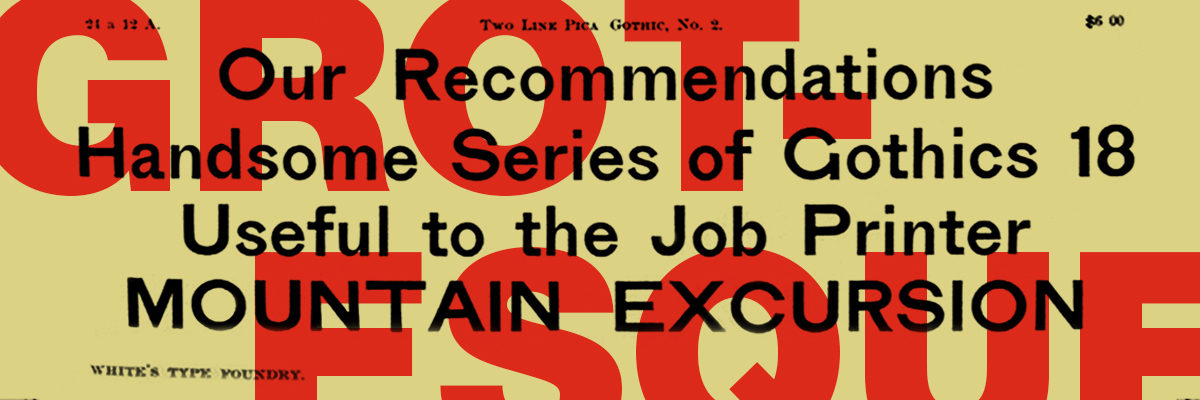
Stanley Morison argues in Politics and Script that the nineteenth-century invention of the sans serif lowercase was no less than ‘the most novel and permanent contribution to letter-design that has appeared on the printed page since the Aldine Italic of 1501’. Given that the sans serif has become the dominant typographic form of the past century (for all but lengthy text setting, and sometimes even for that too), it is more than a little surprising that its early development in the century prior — from a brutish all-caps poster style into a viable upper- and lowercase text style — has scarcely been studied or documented. This talk will trace its evolution as uncovered to date by a primary-source research project in progress.

Registration is now closed

When:
Tue, May 17, 2016

Where:
Koret Auditorium at the San Francisco Public Library Main Branch
100 Larkin Street, San Francisco, CA


The Herb Lubalin Lectures are recorded and made available here and on Vimeo with the generous support of Adobe.


About Sara Soskolne

Sara Soskolne 2015
Sara Soskolne is senior designer at Hoefler & Co. Though originally a graphic designer in her home town of Toronto, after ten years of apparently never being able to find quite the right typeface for the job she finally decided to just learn how to make them herself, jumping careers and an ocean to study typeface design at the University of Reading where she earned her MA in the subject in 2003. Since joining H&Co she has contributed to the design of a wide range of typefaces including Verlag, Chronicle, Sentinel, Gotham, Tungsten and Quarto. She has taught typeface design at the Yale School of Art, at New York’s School of Visual Arts, and with Sumner Stone was a founding instructor of the Type@Cooper Condensed Program.