Integrating Letter & Image: Drawing on Early Influences
with
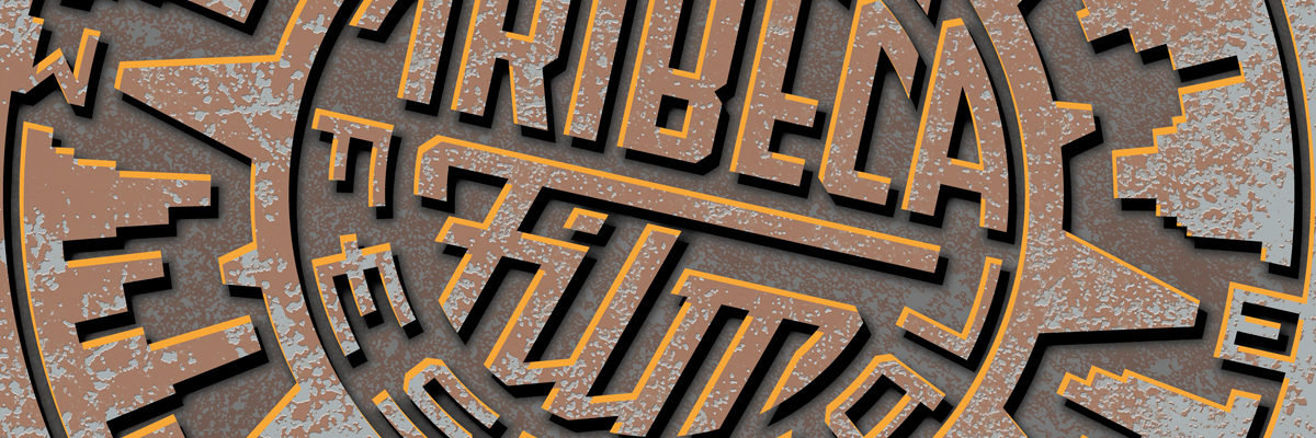
Michael Doret
Letterforms and imagery may be thought of as two sides of the same coin. It will be the purpose of this two-day workshop to demonstrate how the rules governing letter and image can be bent, how they can enhance one another, and how they can be fused to create new hybrid forms. Participants will be asked to challenge conventional thinking about the distinctions between letter and image and explore ways to blur the lines between the two.
Additionally participants will be asked to filter their problem solving through the prism of their own personal influences. Designers begin to develop their aesthetic sensibilities from what they are exposed to when they’re young. For Michael it was the banners, the colorful signage and cacophony of Coney Island, and the bright lights and billboards of Times Square that would inform his work as an adult. For others it will be quite different—and very personal. But whether or not one is consciously aware of them, everyone has those early influences that work silently behind the scenes, shaping one’s aesthetic.
Participants will select and execute one of several letterform/imagery projects, and receive constructive feedback at various stages during the workshop. This work may take the form of a finished drawing or can be brought into the digital realm.This workshop is limited to 12 students.
About Michael Doret