
Proportions
with
John Downer
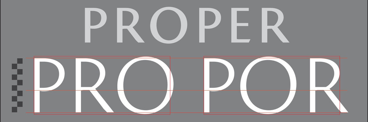
This course will address matters of concern regarding character proportions, stroke weights, curve descriptions, and miscellaneous ratios in type design. To quote the late American type designer, R. Hunter Middleton: “‘Relationship’ is the most important word in type design.”
But, in order for letterforms to perform correctly, they must be spaced correctly. Drawing letters and spacing them are simultaneous activities. The voids between characters must be allowed to play a role in determining character proportions. Secrets of spacing will be laid bare, as Mr. Downer demystifies the process and explains established principles via basic exercises.
Learning, applying, and remembering special hierarchies which pertain to the discipline of type design will help novices avoid countless common mistakes. And, even though makeshift gauges and calipers may be of use, “eyeballing” will ultimately determine the correctness of form and arrangement.
Required Materials
- no. 2 Pencil
- eraser
- scissors
- 1/2" black artists' tape
- clear scotch tape
- 1 Zig Memory systems brand calligraphy pen, 2-ended with 2.0 mm and 5.0 mmfelt nibs black
- pad of 14" x 17" layout paper (or tabloid copier paper)
- about 10 sheets of at least 9" x 12" or bigger
- reducing glass
- 11" x 17" grid paper with 1/4" squares (4 x 4)
- X-acto knife with #11 blade
This class is an elective for the Type@Cooper Extended Program students and available for open enrollment if space permits. The class is limited to 16 people.
If places are available, registration for this workshop will open soon. For updates and reminders about Type@Cooper offerings and events, please join our mailing list. As soon as this workshop and others that are electives for the Extended Program students is available, an email will go out to the mailing list.
Save the date: Sat., Nov. 04, 10:00AM
About John Downer

Mr. Downer is a sign painter, a typeface designer, and an educator. He has written about type and type history for various publications and is widely known as a perceptive type critic. His typefaces have been published by Bitstream, Font Bureau, Emigre, House Industries, and Design Lab. Among his most popular type designs are Iowan Old Style (on Apple Books and iOS 7+), Roxy, Ironmonger, and the ubiquitous food and beverage branding favorite, Brothers.
A native of the Pacific Northwest, a region of the US with a rich history of sign painting and hand-lettering, Mr. Downer was first introduced to commercial pen & brush lettering in the 1960s in junior high school. He began an apprenticeship in a sign painting shop at age 18. He holds BA, MA, and MFA degrees in art.
Mr. Downer has been a journeyman sign painter since 1973, a freelance typeface designer since 1983, and a crusader for designers’ rights his entire adult life. He began teaching lettering at the university level in 1972, making him one of the most experienced American educators in the fields of lettering and typeface design. He’s been teaching in the Type@Cooper program at The Cooper Union since its founding in 2010. He established the Sign Painting Support Group on Facebook as a platform to educate and guide serious enthusiasts and professionals in the principles of letter construction and the tricks of the trade.